Replatforming the Subscription Journey for Record Growth

The goal of this project was to redesign the subscription experience on The Economist website, specifically focusing on the offer pages, in preparation for the launch of our back-end website re-platforming.
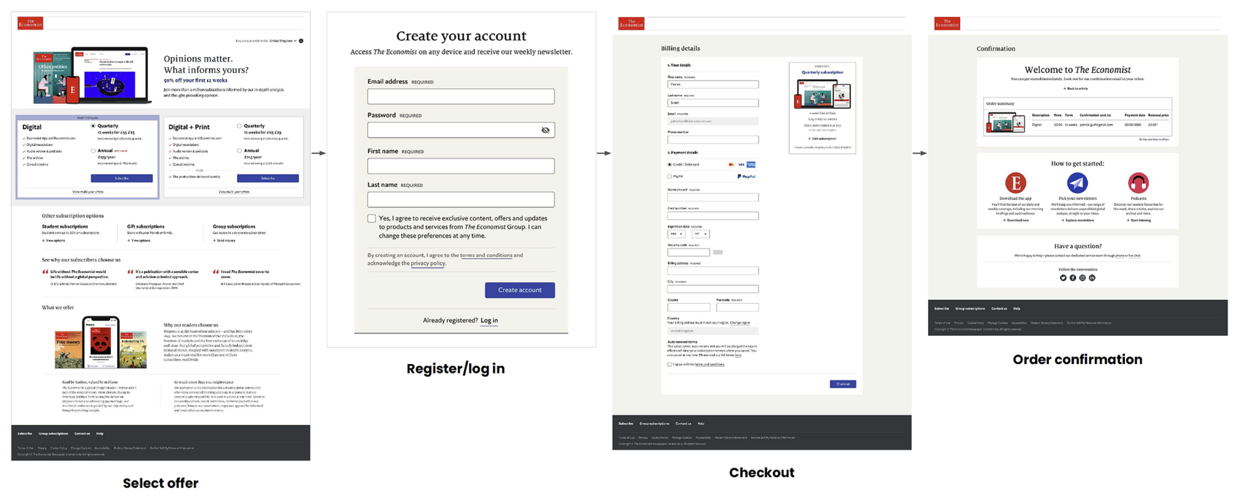
I joined the project midway, with many customer journeys, including the checkout flow, already mostly defined. My role was to redesign the splash pages (top of the funnel) and unify the entire experience under tight deadlines—giving us about two weeks to complete the design and gain stakeholder approval.
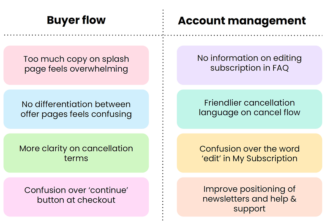
To begin, I reached out to customer service to gather as much existing user feedback as possible on the current subscription journey. I also reviewed the existing journey myself, identifying key issues and pain points.
The entire subscription journey was not visually aligned with our design system.
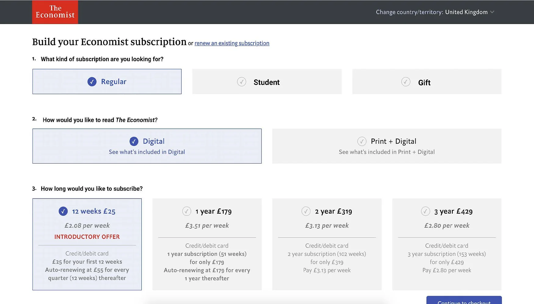
- Offers and terms were split into two steps on desktop and seven steps on mobile, making the checkout process excessively long.
- The subscription builder step led to significant misuse, with users frequently manipulating the pricing to select the lowest-priced offer.
- Pricing was unclear to users until they reached the second step, causing a substantial drop-off when they saw the full price after the introductory offer.
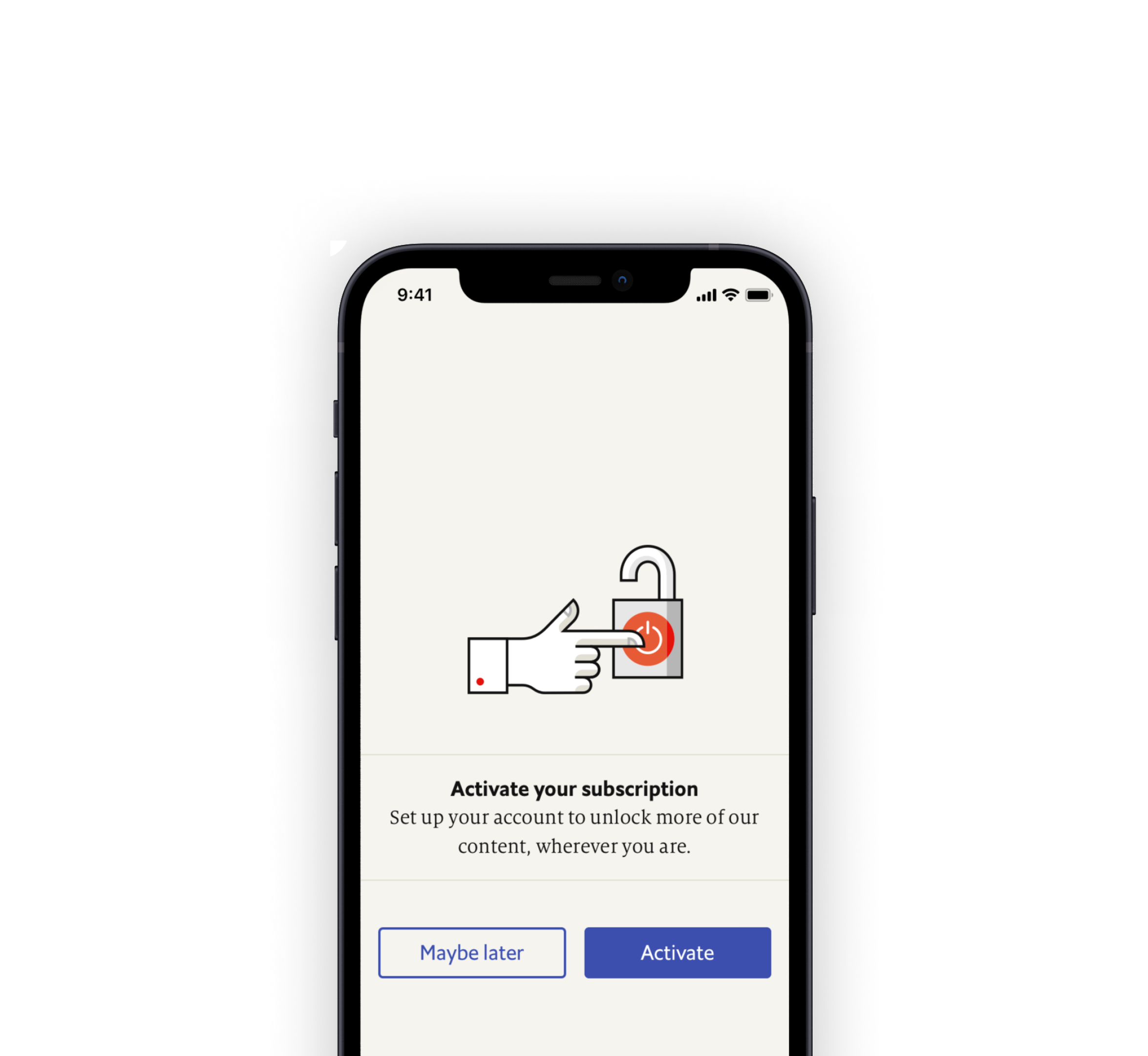
- While we allowed users to check out as a guest, this made account creation confusing, requiring customers to manually activate their subscriptions.
- We did not offer flexible payment options, such as checkout with PayPal or other providers.
- The credit/debit card iFrame appeared outdated and seemed untrustworthy to users.
- We did not provide a regionalized checkout form for customers worldwide, and the form had several accessibility issues.
- The terms of our auto-renewal were unclear and placed in a location that was not immediately visible to users.
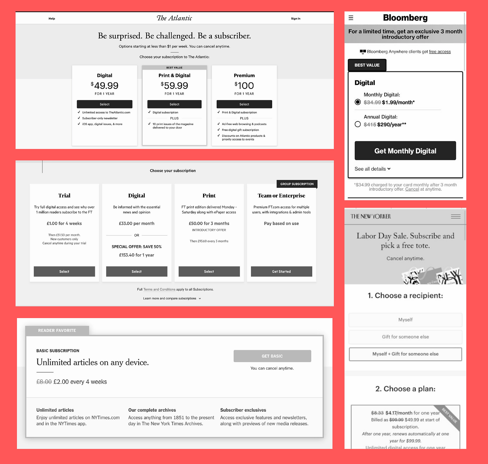
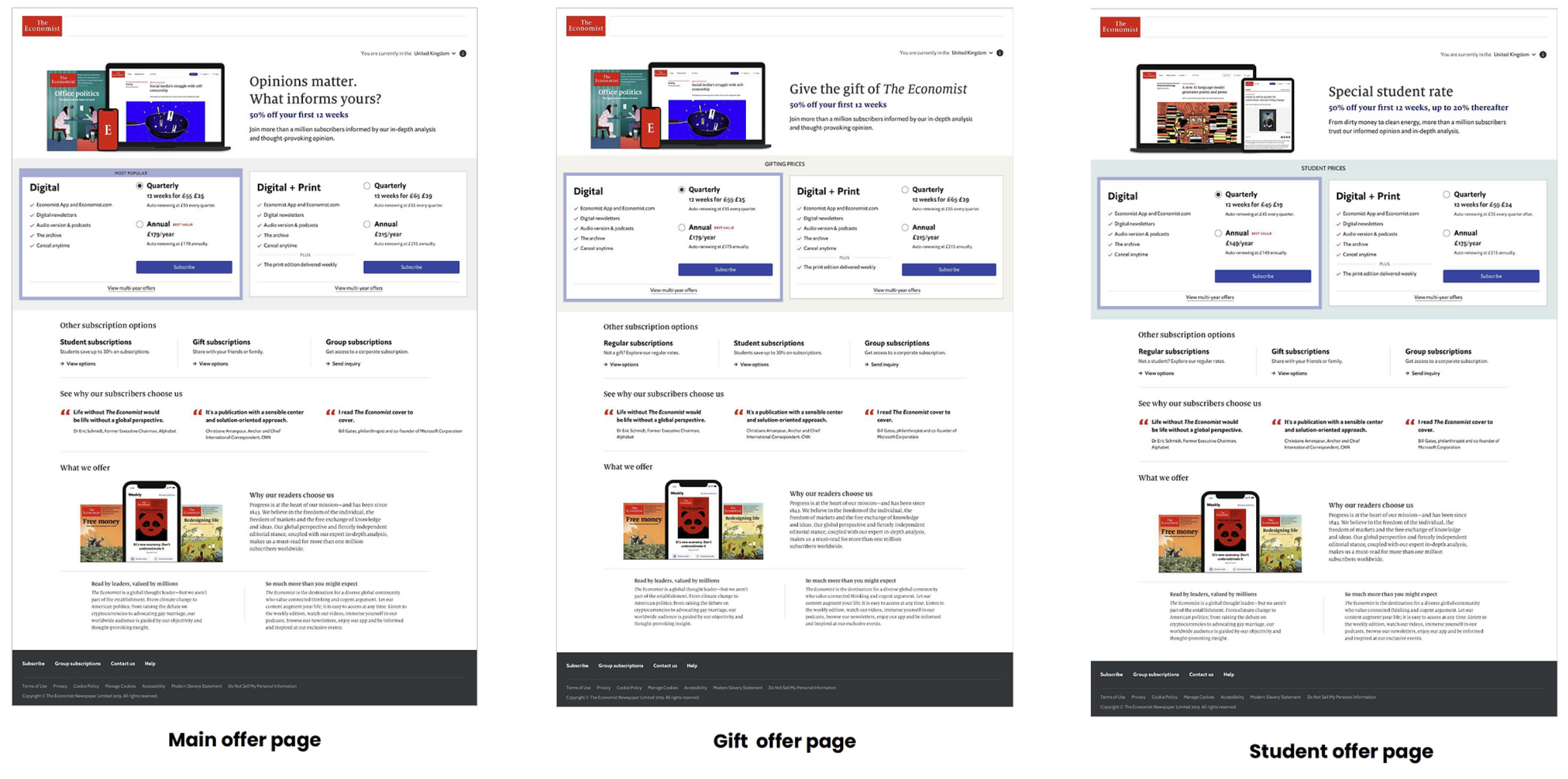
After evaluating our existing subscription journey, I conducted extensive competitor analysis to benchmark our subscription offers against those of other publishers and determine the most effective way to present them.
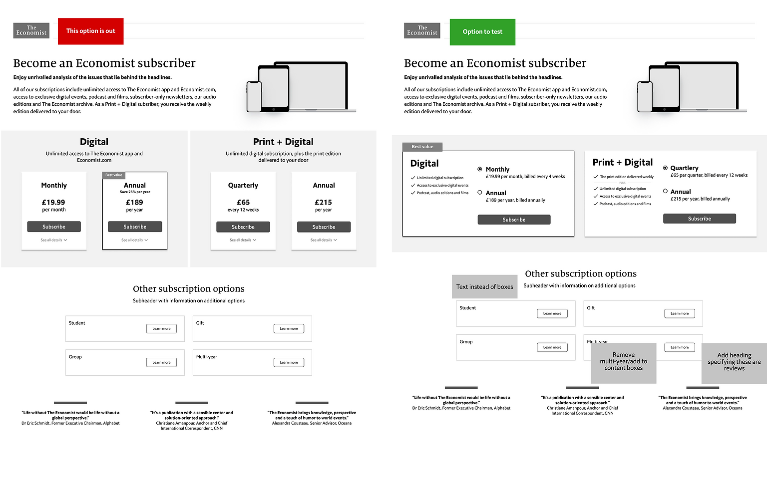
Defining Business Needs: One of the biggest challenges of this project (and splash pages in general) was finding a way to clearly and concisely communicate information about our offers and pricing. The primary request from the business side—particularly from the Chief Marketing Officer, Chief Product Officer, and Managing Director—was to present all this information in a single step, with the overall purchase journey not exceeding three pages.
Given our tight deadlines, I used Figma’s sharing capabilities to quickly create wireframes for potential solutions and share them with the CMO, her team, and engineering daily. I developed 13-15 different approaches, which were reviewed for feedback and iterated upon until we narrowed them down to four options for user testing.
Collaboration with Stakeholders and Engineers: This process ensured that we were evaluating solutions that had been tried and tested in the market while also aligning with business goals and remaining technically feasible within the given timeframe.
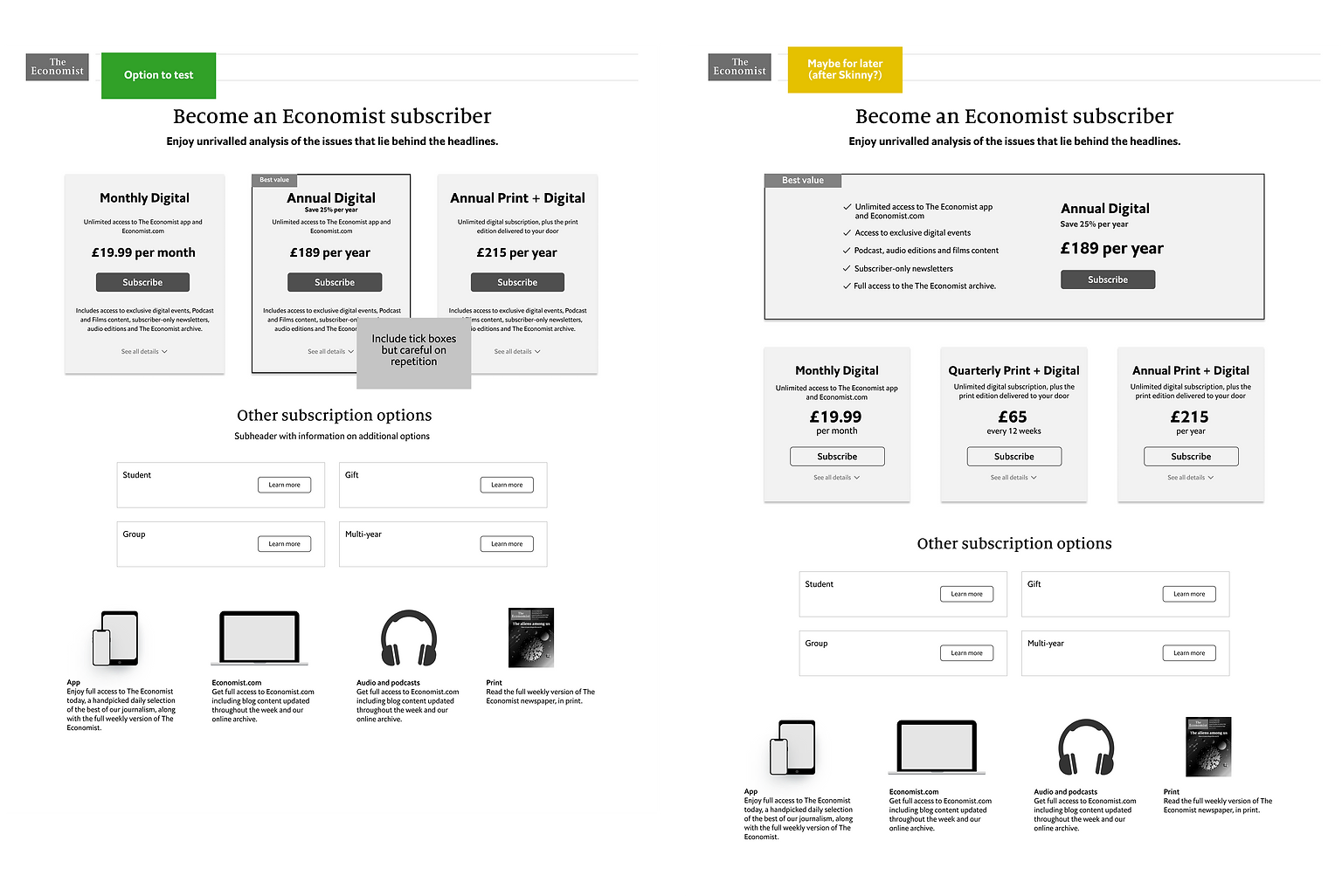
We conducted several rounds of user testing with around 30 users, ultimately narrowing it down to two options.
During this process, senior stakeholders debated a key question about our offers: Should we launch with four offers without a clear anchoring point, or should we present three offers and move one of our most profitable offers to a second page, anchoring around the annual digital option?
Focusing on the User: To guide these discussions, I framed the conversation around user experience and comprehension. We discovered that users took longer to make a decision when presented with four offers, but found both pages equally easy to understand overall. As a compromise, the business decided to launch with four offers and plan A/B testing with alternate design approaches later on.
The page is well structured with clearly laid out options. Costs are well defined and easy to understand.
Now it was time to bring everything together! The checkout and registration journey had already moved into development, so once the offer pages were built, we conducted pre-launch user acceptance testing (UAT).
Documenting Jira Tickets: I organized a UAT study with 20 non-subscribers to test the entire journey and identify potential improvements before launch. We conducted hour-long moderated interviews, where users were asked to complete tasks such as purchasing and canceling a subscription.
I compiled the findings into a comprehensive report, implementing key improvements pre-launch and documenting all other insights in Jira tickets for the BAU teams’ backlogs
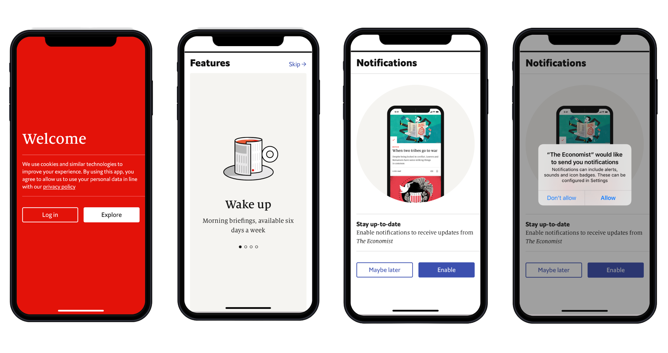
Next, we conducted competitor research and app benchmarking to understand how other companies introduce users to their apps. We found that a simple yet effective solution was to implement an app tour upon first opening.
This project was incredibly fast-paced, with the entire journey designed, built, tested, and launched in about two months. I learned that the most critical factor was clear communication and setting expectations—with stakeholders, engineers, and everyone involved.
While the result wasn’t perfect, we are now launching A/B tests to optimize the splash pages, leveraging the newly acquired data from the back-end re-platforming.