Cross-entitlement

Since the launch of the new app in 2018, we consistently received feedback from in-app subscribers requesting access to economist.com. Given the urgency of this fix, we approached the project differently than usual—bypassing extensive initial user research. The main challenge lay in the ways of working, as this was a cross-functional project involving PMs and engineers from acquisition, entitlement, and the app teams.
Collaborating with PMs & Engineers: Working across teams, I took on the responsibility of coordinating efforts on the product side. I collaborated daily with product managers, engineers, and delivery managers to ensure the project stayed on schedule, define requirements, determine phasing efforts, and communicate effectively with senior stakeholders.
This project offered clear benefits for users and compelling advantages for the business. We modeled potential commercial benefits by building cross-entitlement within the app, identifying a significant opportunity to improve retention and engagement metrics.
Opportunity: 102,240 in-app subscribers on New App worth $2.54m in annual recurring revenue.
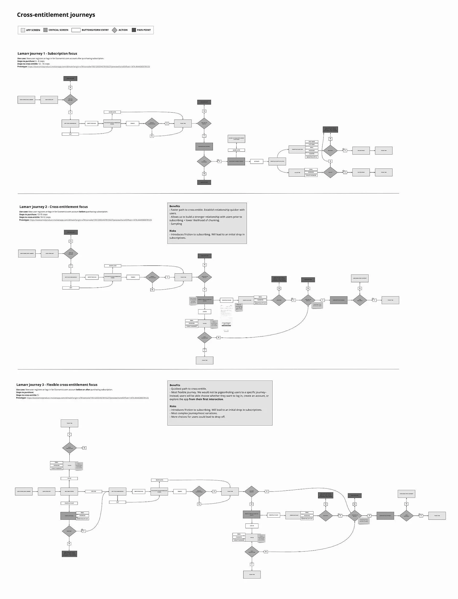
One of the key questions we faced was when to prompt users to register—before or after subscribing?
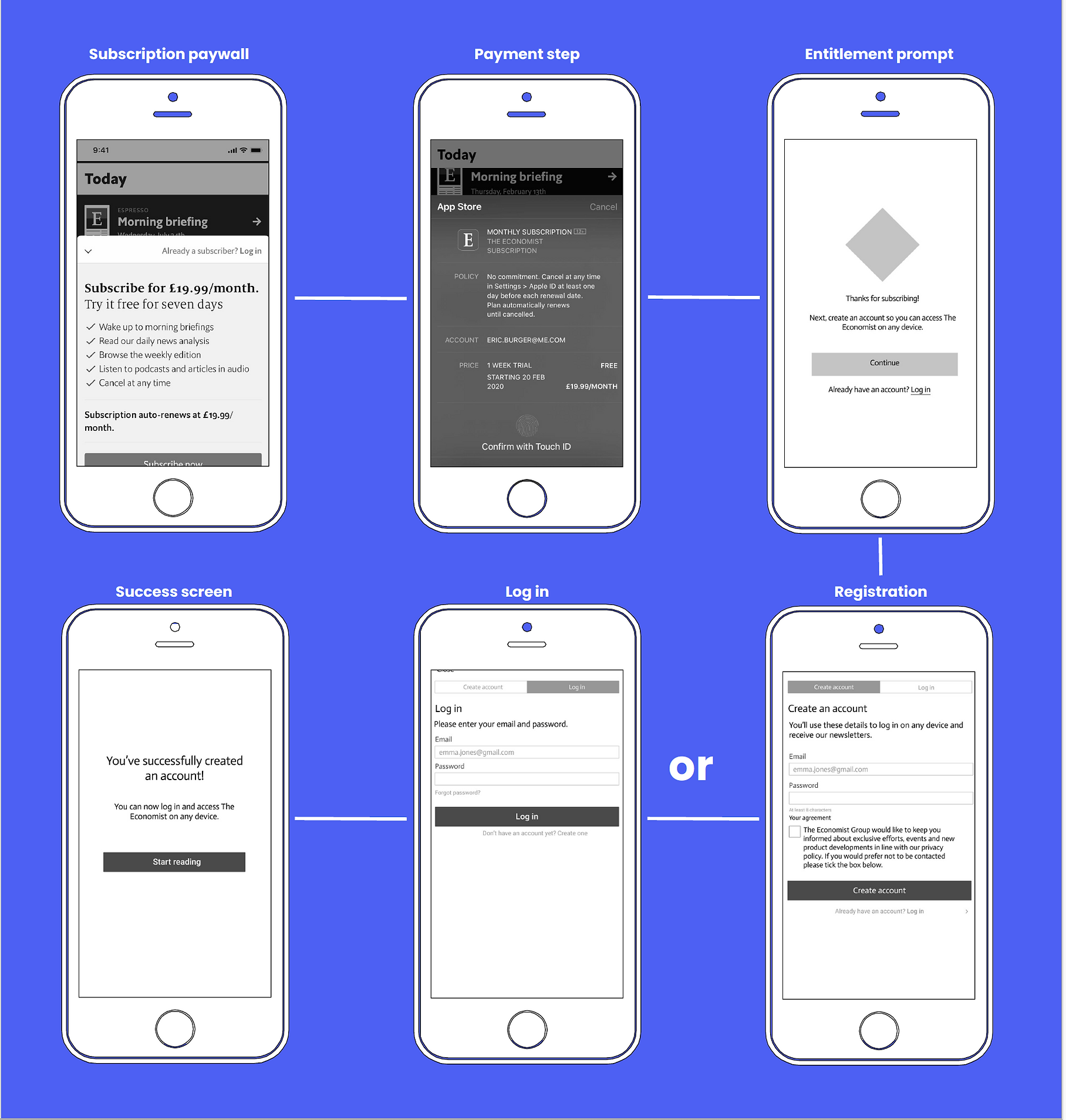
Considering Technical Feasibility: I mapped out three potential journeys: registration before subscription, registration after subscription, and a hybrid approach. We discussed these options with the engineering and product teams and decided that, for our MVP, the app was best suited to enable registration or login after subscription.
For phase 2, we planned to build out the registration or login process before subscription to better facilitate sampling across both the website and app.

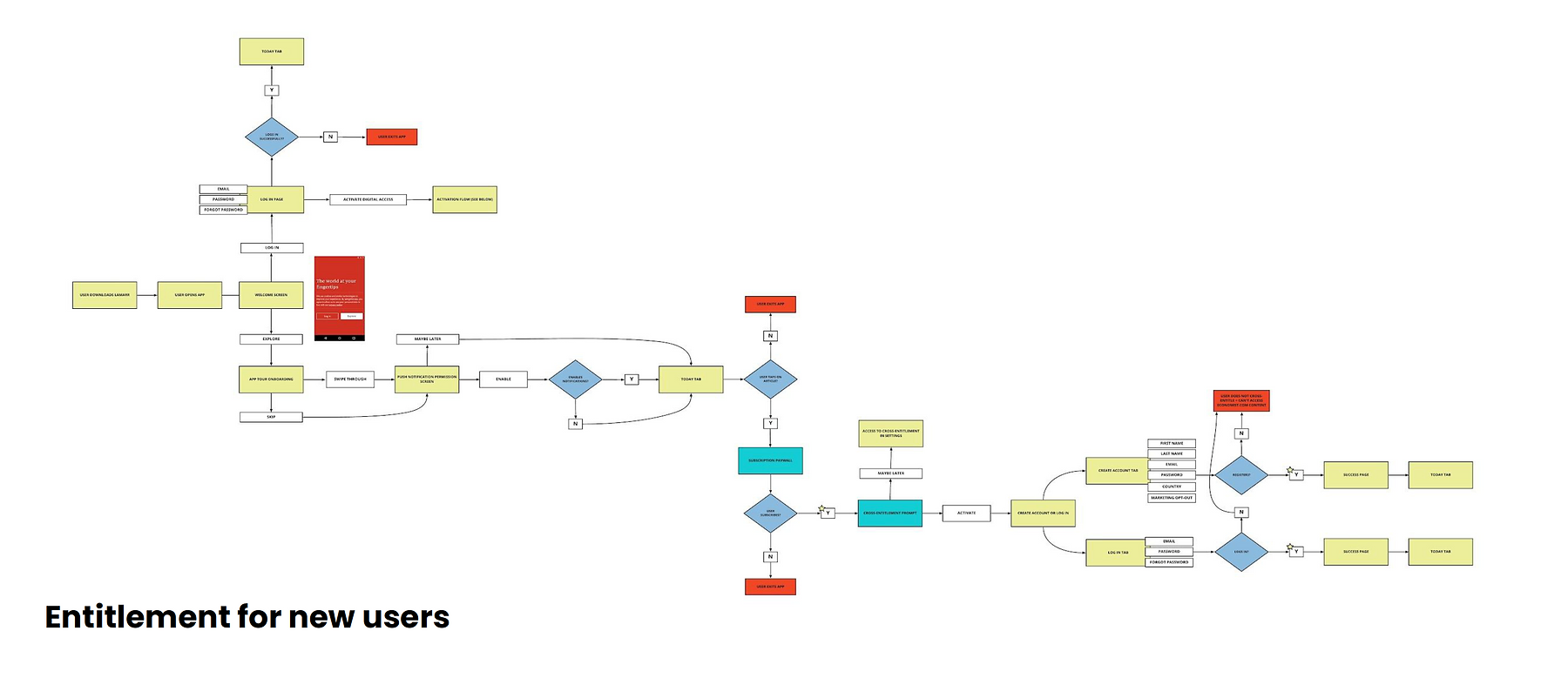
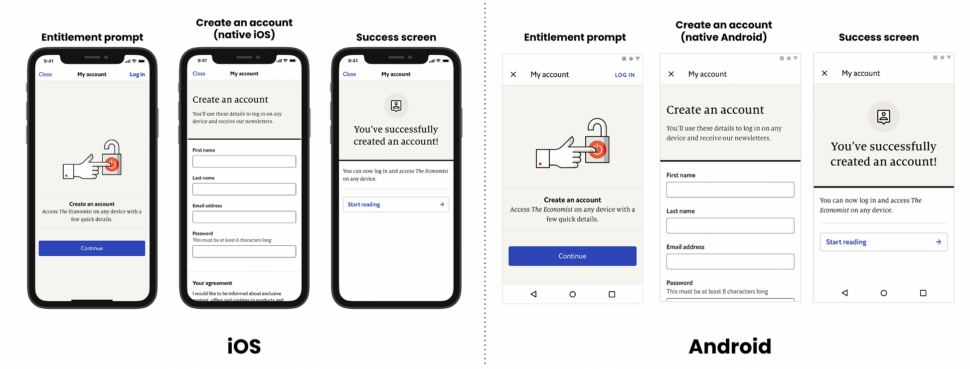
I wireframed potential solutions, accounting for various edge cases and user types in each journey, while also considering potential differences between Android and iOS. We eventually narrowed it down to two journeys: entitlement for new users and entitlement for existing users. I collaborated with our UI designer and copywriter to create high-fidelity mockups for user testing.

We conducted seven usability tests with non-subscribers and found that all users considered the account creation process simple, straightforward, and easy to navigate. There were no significant concerns identified regarding the overall flow of the experience. Additionally, the initial prompt screen effectively communicated the importance of creating an account at that stage.
"That's really good to know that it's not tied to my phone, I can access it from my browser or iPhone or an iPad."


This project demonstrated the value of cross-team collaboration in solving complex problems. We successfully launched the feature on schedule in September 2020. The team is now exploring the development of pre-subscription entitlement to enable sampling within our app.