Economist App Tour

In recent years, The Economist has been undergoing a digital transformation aimed at helping subscribers better engage with content online. This effort included the launch of a new mobile app designed to allow readers to moderate and customize their content consumption.
One of the biggest concerns among Economist readers is feeling overwhelmed by the amount of content provided each week. User interviews revealed that this sense of overwhelm is a key reason why some readers choose to cancel their subscriptions—to relieve themselves of the guilt of not being able to finish the entire weekly magazine.
The new app addresses this by offering readers multiple ways to manage their content consumption, such as reading selected articles on the Today page or listening to the audio edition, allowing users to enjoy The Economist without the pressure of reading it cover to cover.
I served as one of the main UX designers for this project, working alongside another UX designer and a UI designer to develop the app’s interface and overall user experience. We collaborated closely with our product and delivery managers, supporting app developers, creating assets, and setting parameters for the project’s build.
Our activities included conducting initial research, such as competitor analysis and benchmarking, mapping user flows for various use cases, and developing multiple wireframe concepts. We also performed user tests and interviews with both new and existing app users, finalized our design concept, and conducted additional usability testing before moving forward with development.
Tools Used: Sketch, Figma, Invision, Validately, Apptentive, and Miro.
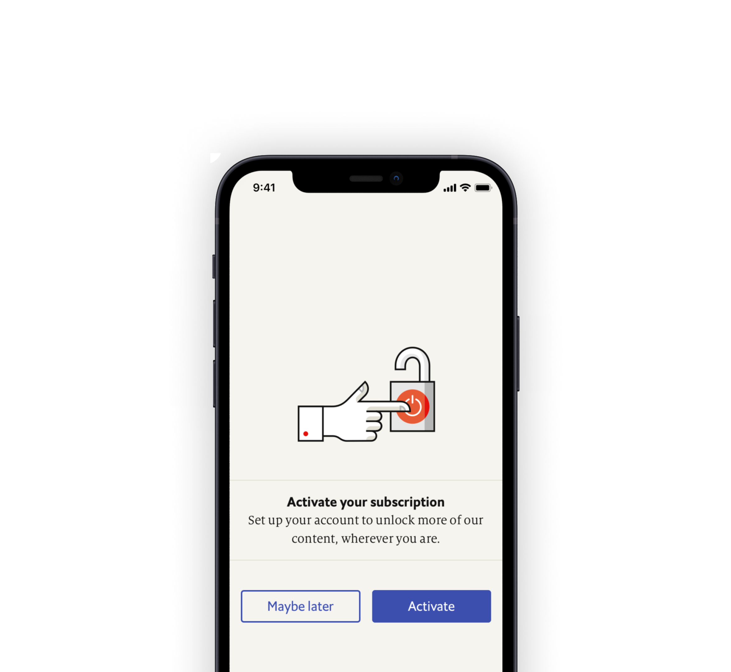
Although the new app provides a unique reading and listening experience for subscribers, we began to notice that users were having trouble discovering all its features. We frequently heard feedback that users believed they could no longer access the Weekly magazine as they did in the old app (even though they could) and that many only realized months later that all articles included an audio option.
We realized we were not effectively guiding users through the discovery process, and potential new subscribers who downloaded the app were unaware of the available features before deciding to subscribe.
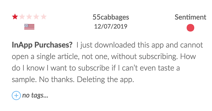
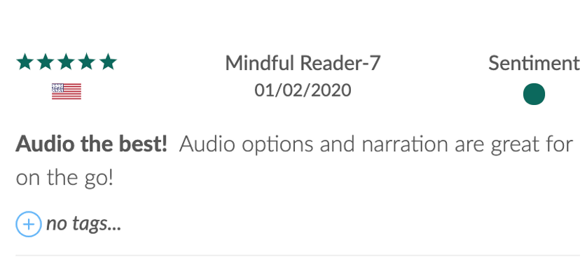
We began by exploring various ways to introduce users to our app. We reviewed past interviews with current Economist subscribers and app users to identify the frustrations and challenges they experienced while using the app.
One of our key findings was that many readers only discovered features they were interested in months after first using the app. As one user put it:
"It was starting to feel like a chore to read through all of these articles. But about three months after subscribing I noticed you can listen to them, and that's how I get through them now."
We gathered these insights to inform our initial concepts and analyzed quantitative data to identify the app features that users were most engaged with.
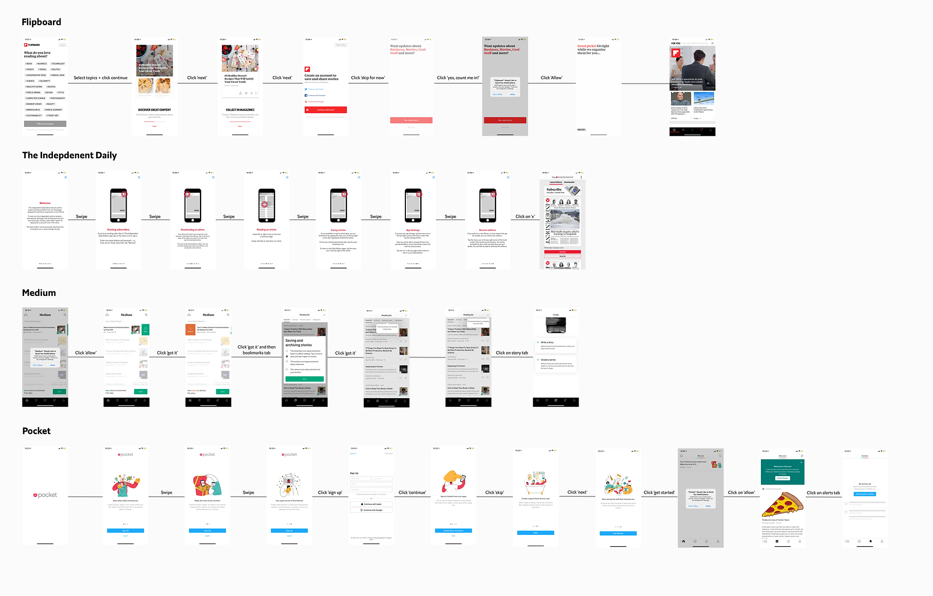
Next, we conducted competitor research and app benchmarking to understand how other companies introduce users to their apps. We found that a simple yet effective solution was to implement an app tour upon first opening.
After completing the initial user research and benchmarking, we defined use cases and developed user journeys. This helped us to better scope out what was feasible for the project and to clarify the goals we aimed to achieve for our users.
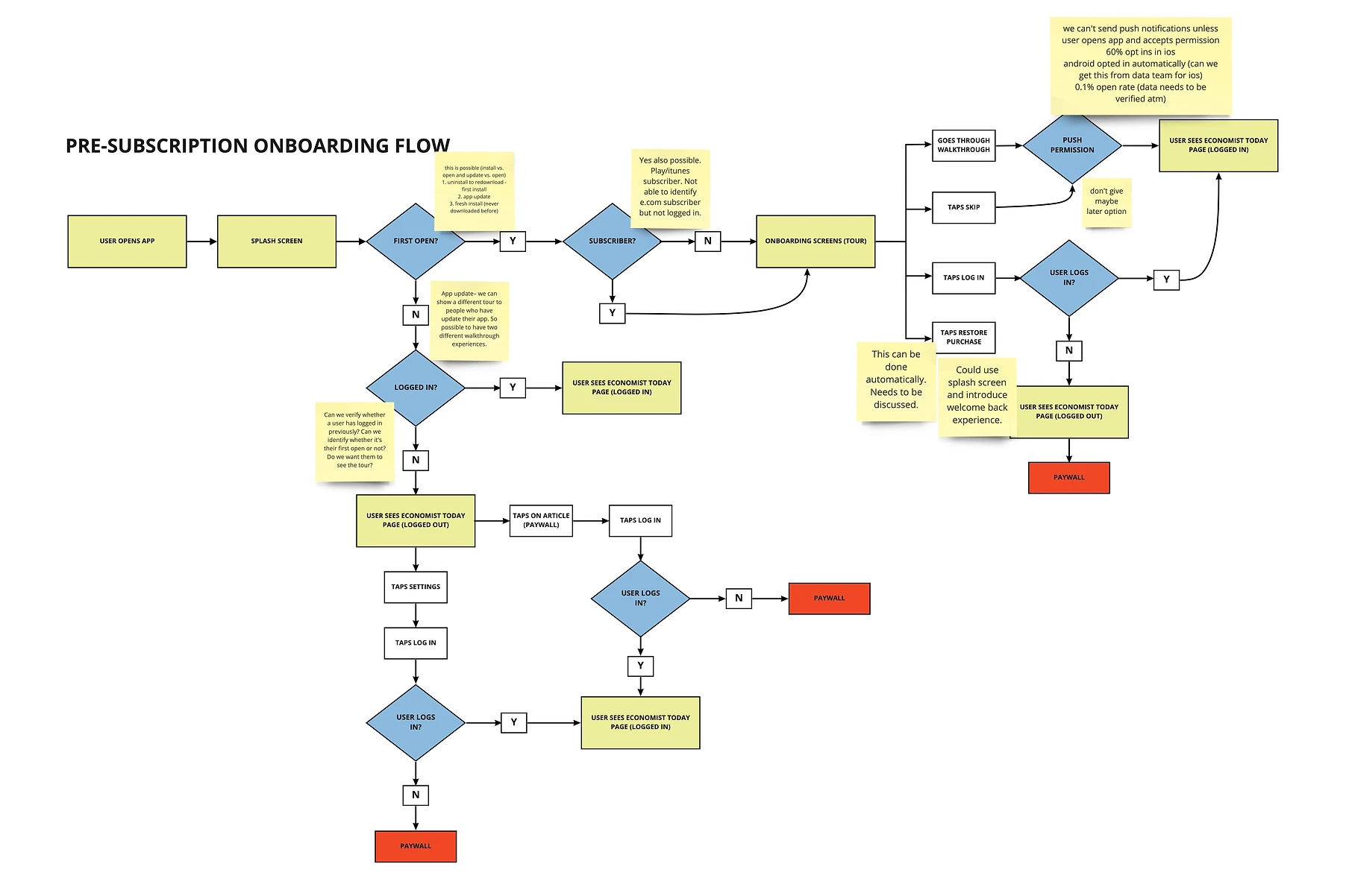
After completing the initial user research and benchmarking, we defined use cases and developed user journeys. This helped us to better scope out what was feasible for the project and to clarify the goals we aimed to achieve for our users.
.webp)
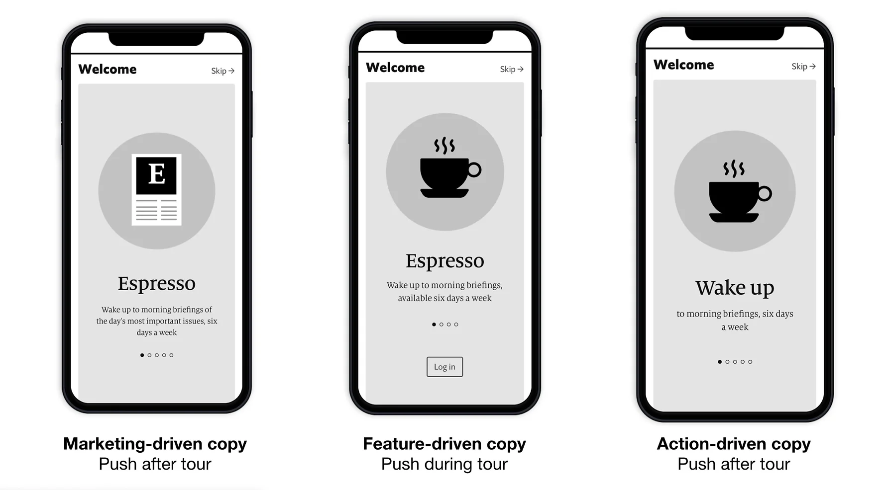
We then began sketching and wireframing various concepts. We developed three wireframe versions, each featuring different imagery, copy, and a distinct order of presenting content to test with users. Although the differences between these versions were subtle, the impact of the copy on user perceptions of the app was significant. We discovered this through brief usability tests, which included both moderated and unmoderated interviews with subscribers and non-subscribers.
%201.png)