Treatment Library Test

After launching our care-focused onboarding, we noticed that a key question patients frequently asked was about the types of treatments we offer. Shifting away from a product-focused onboarding experience meant providing less specific information about treatments, as our messaging emphasized overall quality of care.
Given the strong interest in our treatment options, I decided to conduct an A/B test to introduce patients to our treatment library. Previous onboarding tests showed that any information we present to patients needs to be personalized based on their responses throughout the onboarding process.
Instead of simply telling patients about our treatments, I designed a new approach that involved collecting information on the types of treatments they are or are not comfortable with and then presenting our treatment library as a tailored response.
To define the purpose of this test, we gathered baseline data and formulated a hypothesis to guide our approach.
Problem
Our overall conversion rate was around 2%. Many patients were dropping off because they felt they needed more information, leaving comments like “What is the prescription medication?”, “I know nothing about this product,” “I can’t exercise my knees,” and “What do you mean by 1 non-opioid?” in our payment drop-off survey. In user testing, participants frequently mentioned that they would need more information about the types of treatments we offer to consider trying our service.
Our audience generally has had negative experiences with the healthcare system. Many feel they have already tried everything or have been pushed into treatments they did not want. We needed to build trust by addressing these concerns.
Hypothesis
We believe that by 1) introducing a moment to capture patients’ expectations about their treatment and 2) presenting our treatment library in response to their input, we could build trust and reduce drop-off rates at the payment stage by providing relevant treatment information tailored to each patient’s input.
Goal
To reduce drop-off rates at the payment stage, thereby increasing overall conversion rates.

I began by identifying the types of questions patients might have about our treatments, as well as the questions we might need to ask them. I met with internal stakeholders to discuss which treatments we wanted to highlight from our library and to determine, at a high level, how specifically we should describe these treatments.
In discussions with Dr. Jacob, we explored the various categories of treatments for pain, ranging from the most to the least invasive, natural to medical, and over-the-counter to prescription options. We also gathered data on the types of treatments patients were already using and found that most had tried a combination of approaches from different categories.
I also looked for inspiration from how other health-tech companies introduce their treatments. I found that there isn’t a standard approach being used, leaving considerable room for improvement in existing patient experiences.
My conceptual focus was on gathering information about patients’ treatment preferences. I began by wireframing different ideas that included a prompt with simple yes/no options, allowing patients to indicate what they are or aren’t comfortable with. Next, I explored how to effectively position our treatment library as a response based on their input.
I conducted user tests on several rapid prototypes that varied the prompts slightly and continued to explore different UI options for presenting our treatment library in a way that accurately reflected patient responses. This process revealed that our approach effectively helped patients feel heard while also clearly communicating the types of treatments available at Clearing. The design and research process took about two weeks, followed by several weeks of development before launching the A/B test.

We launched the treatment library A/B test and measured its performance. By the time of the launch, we were pivoting our business model to onboard patients with insurance. The results of this test would help us decide whether to expand on this prompt framework or eliminate it in the upcoming onboarding redesign, part 2.


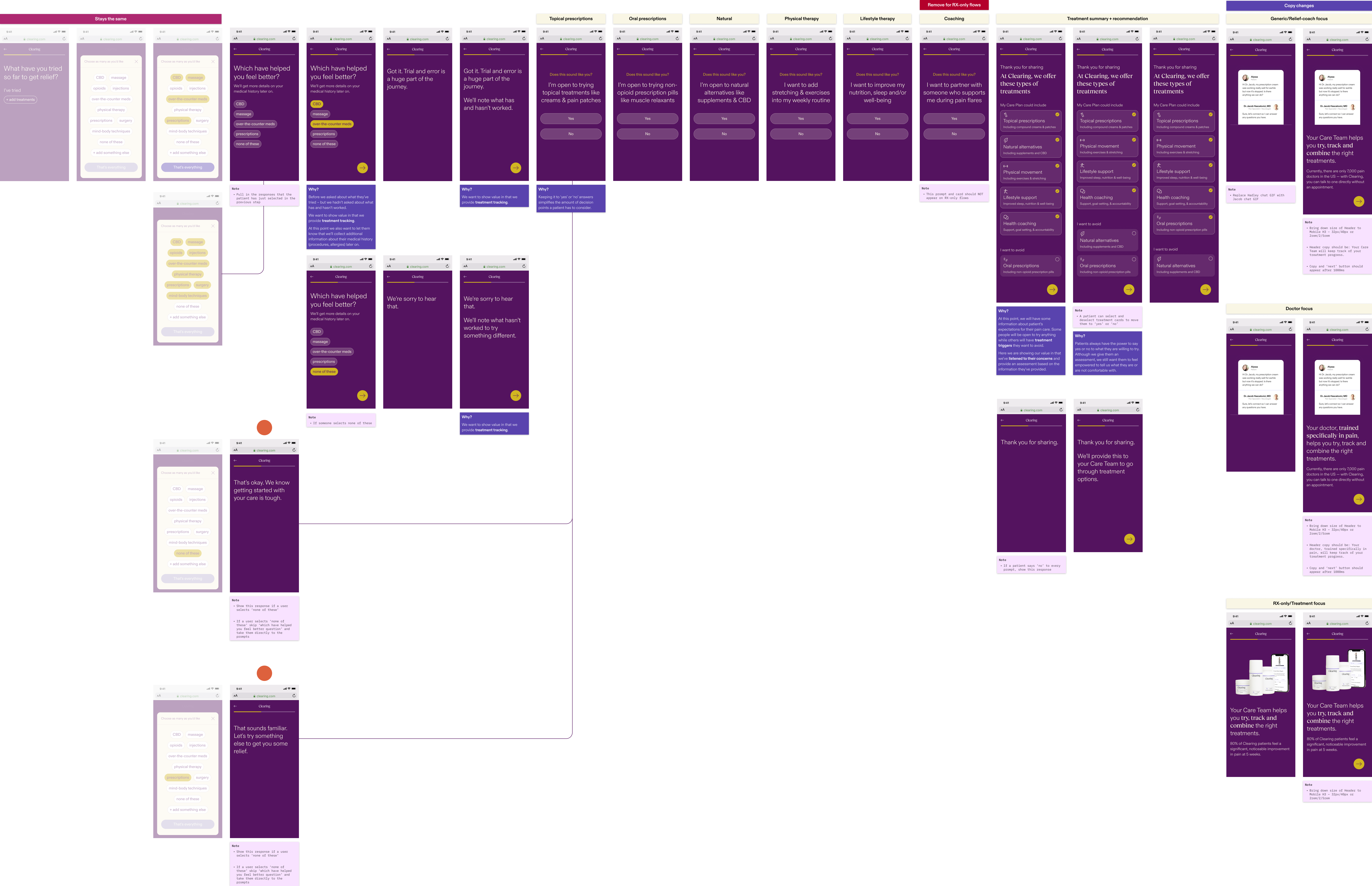
We ran the A/B test for about a month before reviewing the results. Overall, we found that patients who interacted with the treatment prompt and library were more likely to convert than those who did not. We observed a range of behaviors, from patients expressing interest in all treatments to those interested in only a few, and some indicating no interest at all.
We also noticed that many patients engaged with the treatment library summary at the end, with some de-selecting treatments they had initially chosen and others selecting treatments they had initially declined. This was an insightful test that ultimately led us to expand this concept to gather preferences on other aspects, such as the type of care patients want from a provider.
As we now focus on redesigning our onboarding process to accommodate patients with insurance, we have built upon this framework to further promote our patient-led, care-focused model.